Was passiert, wenn digitales Design ethische und moralische Prinzipien verletzt? Das Ergebnis meines Bachelorprojekts war eine vollständig ausgearbeitete interaktive Website, die Nutzer*innen auf spielerische und humorvolle Weise über manipulative Designstrategien aufklärt.
Role: Usability Research, UX/ UI Design, Branding, Bachelor Projekt
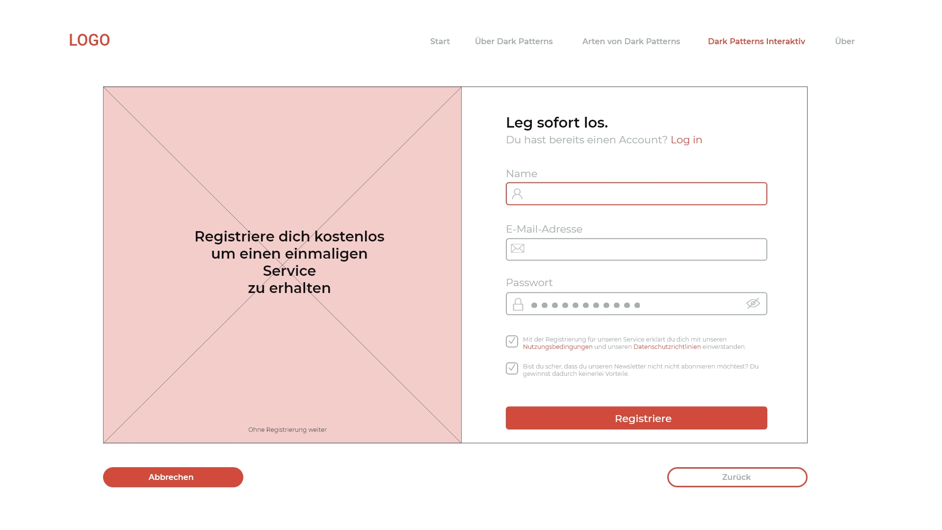
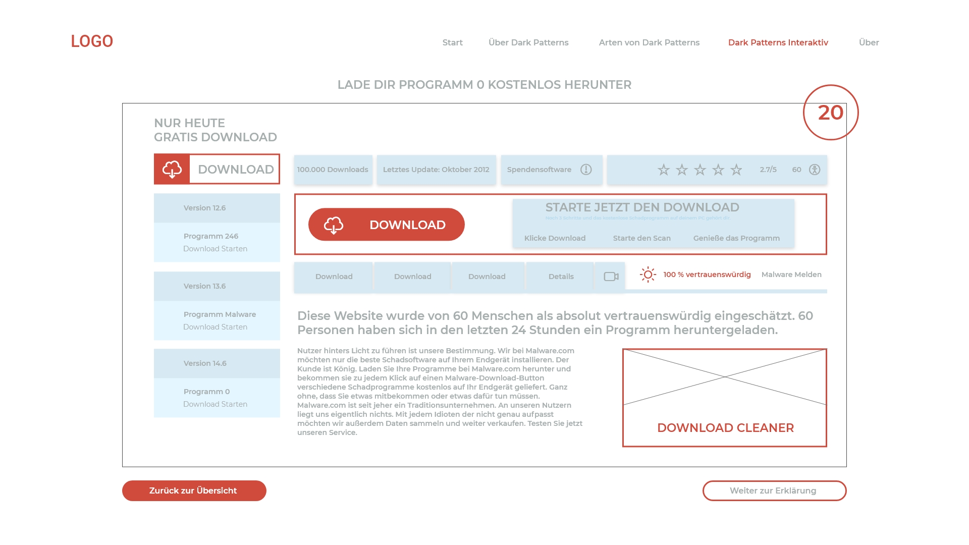
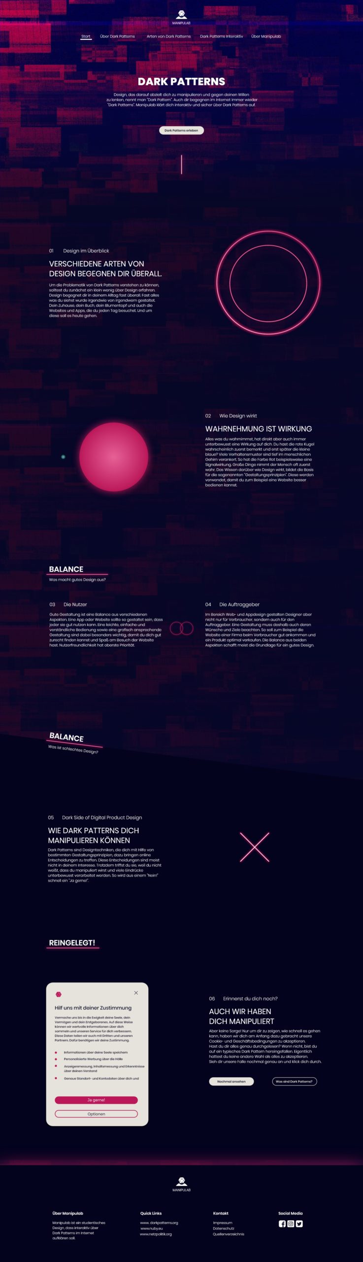
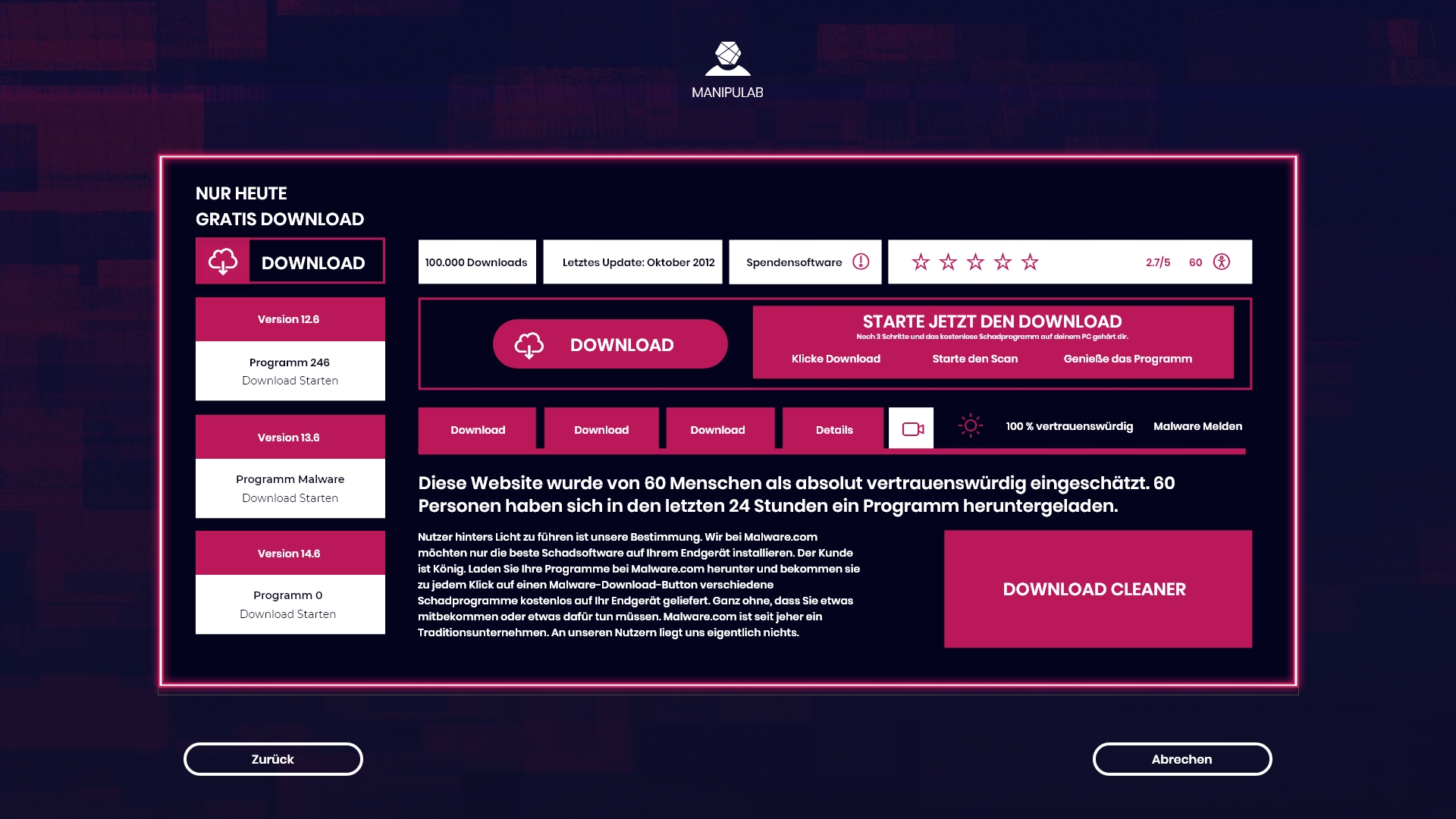
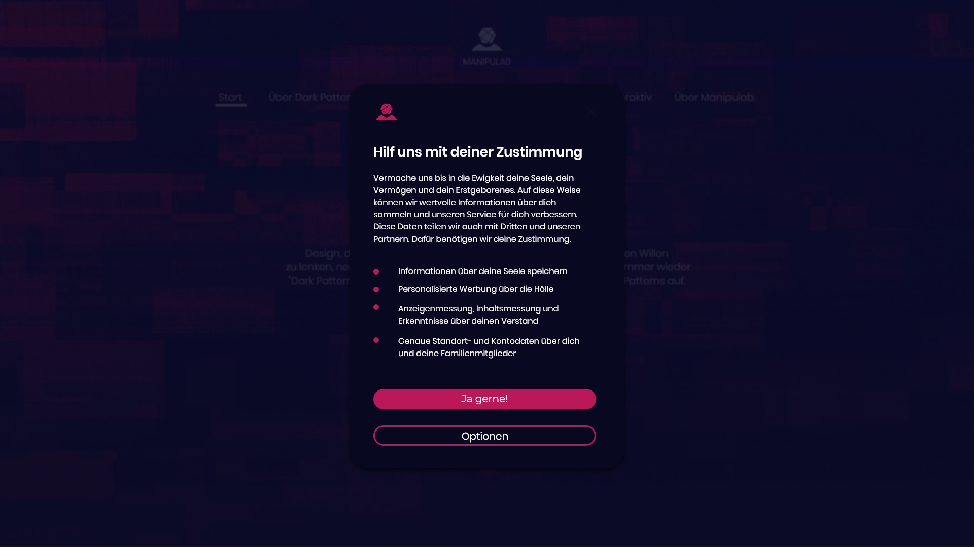
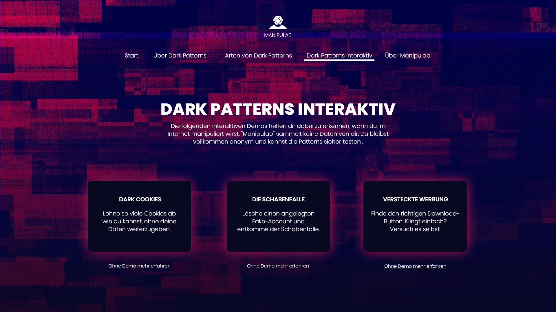
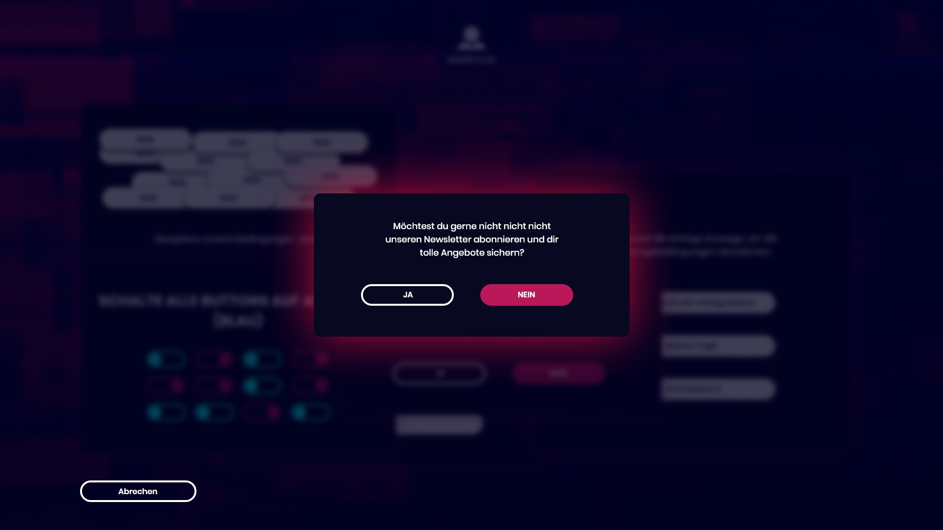
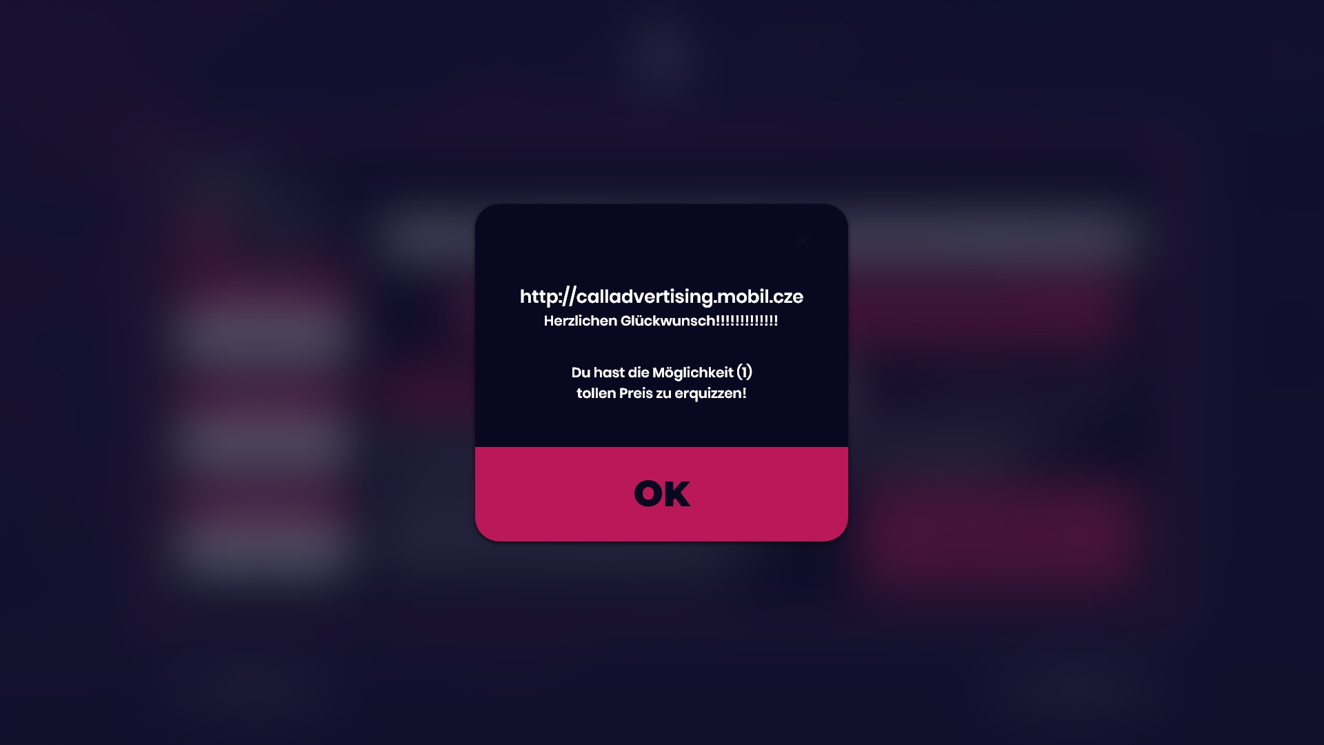
Dark Patterns sind manipulative Designtechniken, die Nutzer*innen zum Vorteil von Unternehmen in eine bestimmte Richtung lenken, ohne deren wahre Wünsche zu berücksichtigen. Sie nutzen Verhaltenspsychologie, um Entscheidungen zu beeinflussen, die nicht immer den tatsächlichen Präferenzen entsprechen. Ein Beispiel sind Cookie-Banner, bei denen es einfach ist, die Standardeinstellungen zu akzeptieren, aber das Deaktivieren von Tracking schwerer ist. Solche Praktiken sorgen für Unklarheiten, frustrieren Nutzer*innen und können Risiken in Bezug auf Betrug und Datensicherheit mit sich bringen.
Manipulation
Die Nutzung von Dark Patterns ist mittlerweile normalisiert. Besonders große Unternehmen wie Meta und X machen es sich leicht, Menschen zu manipulieren und auszunutzen.
Sicherheit
Der Einsatz von Dark Patterns erschwert den Verbraucherschutz.
Unwissenheit
Das Unwissen der Verbraucher*innen und die häufige Nutzung von Dark Patterns führen dazu, dass diese Manipulation oft akzeptiert wird.
Recherche
Fokusgruppe
Fragestellung: Soll die Website als Leitfaden für UI/UX-Designer*innen oder als interaktives Informationsarchiv für Laien dienen?
Umsetzung
Laien zeigten ein größeres Interesse und einen höheren Informationsbedarf als Designer*innen.
Designer*innen fühlten sich ausreichend informiert.
Laien hatten bereits Erfahrungen mit Dark Patterns, erkannten diese jedoch erst, nachdem sie den Begriff kennengelernt hatten.
Dark Patterns wurden als unangemessen und unverhältnismäßig wahrgenommen.
Die Teilnehmer*innen wollten mehr über das Thema erfahren.
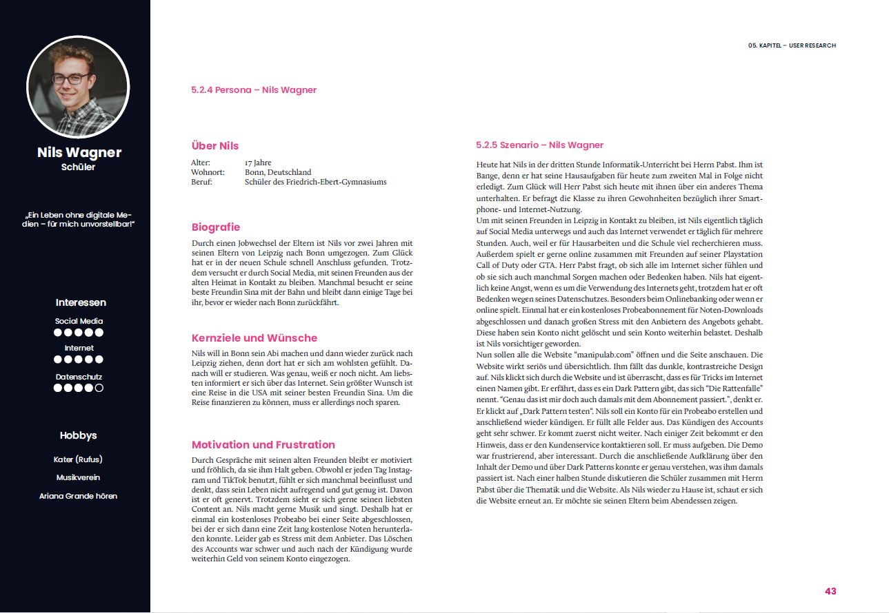
Nils Wagner (Student) & Mario Pabst (Lehrer)
Personas & Scenario
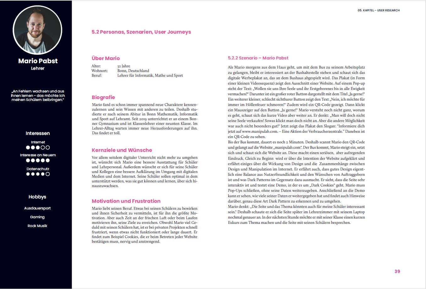
Es wurden mehrere Personas entwickelt, um die Zielgruppe besser zu definieren. In diesem Fall lag der Fokus auf Laien, insbesondere Studierenden und Lehrkräften, um das Bewusstsein für Dark Patterns frühzeitig zu schärfen. Diese Personas halfen dabei, den Inhalt und die Herangehensweise gezielt anzupassen, um die Zielgruppe effektiv zu informieren und zu aktivieren.
Recherche
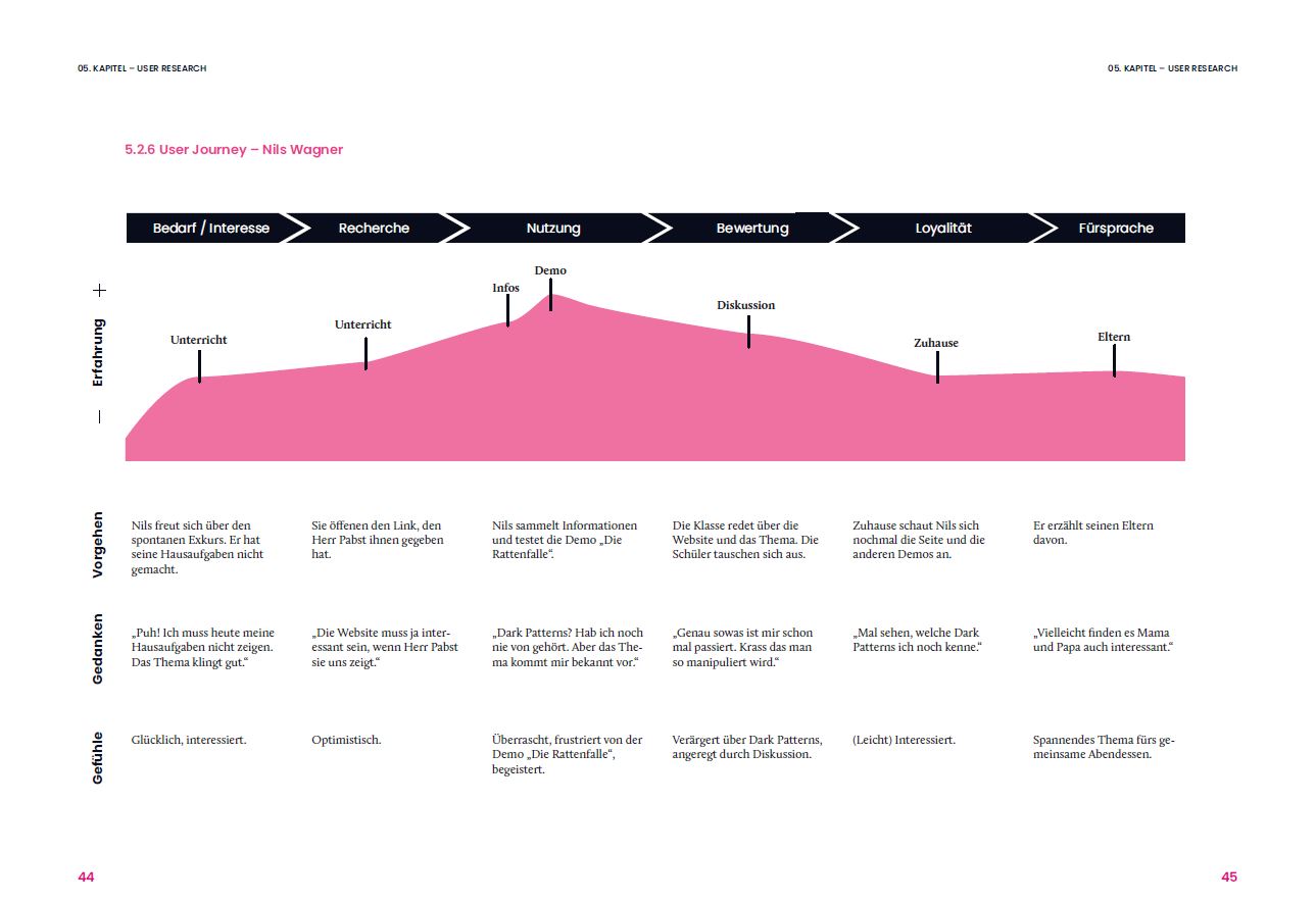
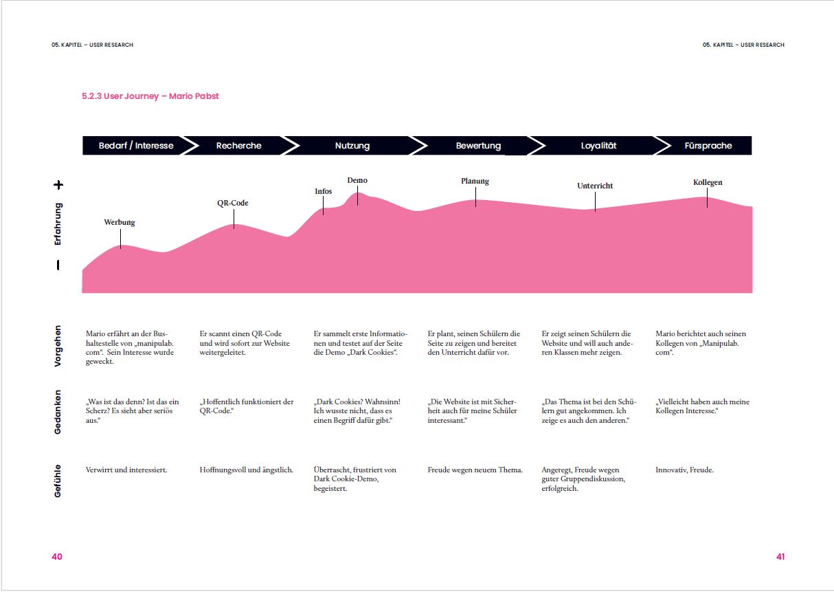
User Journey
In meiner Arbeit habe ich die User Journey-Methode verwendet, um die potenzielle Funktionalität von Manipulab.com genauer zu analysieren. Die Methode war auch entscheidend, um zu definieren, wie die Website genutzt werden könnte.
Wireframes
Recherche
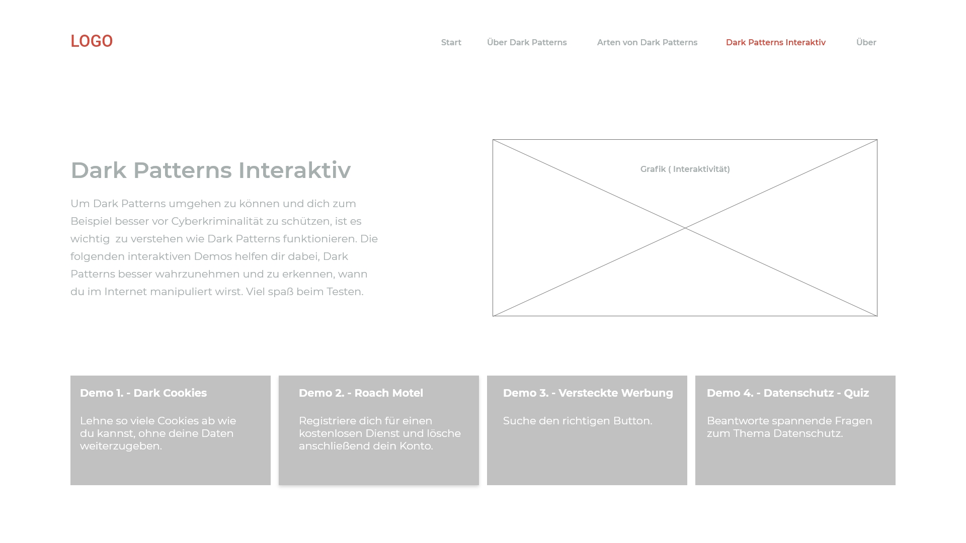
Mit Hilfe der vorherigen Ergebnisse habe ich Wireframes (zunächst Skizzen) erstellt. Da die Website viele interaktive Elemente enthalten sollte und das Interaktionsdesign besonders ausgeklügelt sein musste, war es wichtig, alle Schritte präzise zu planen. Es musste festgelegt werden, welche spezifischen Funktionen, Informationen und Dark Patterns angezeigt werden sollten
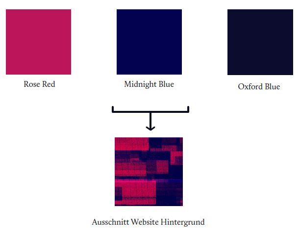
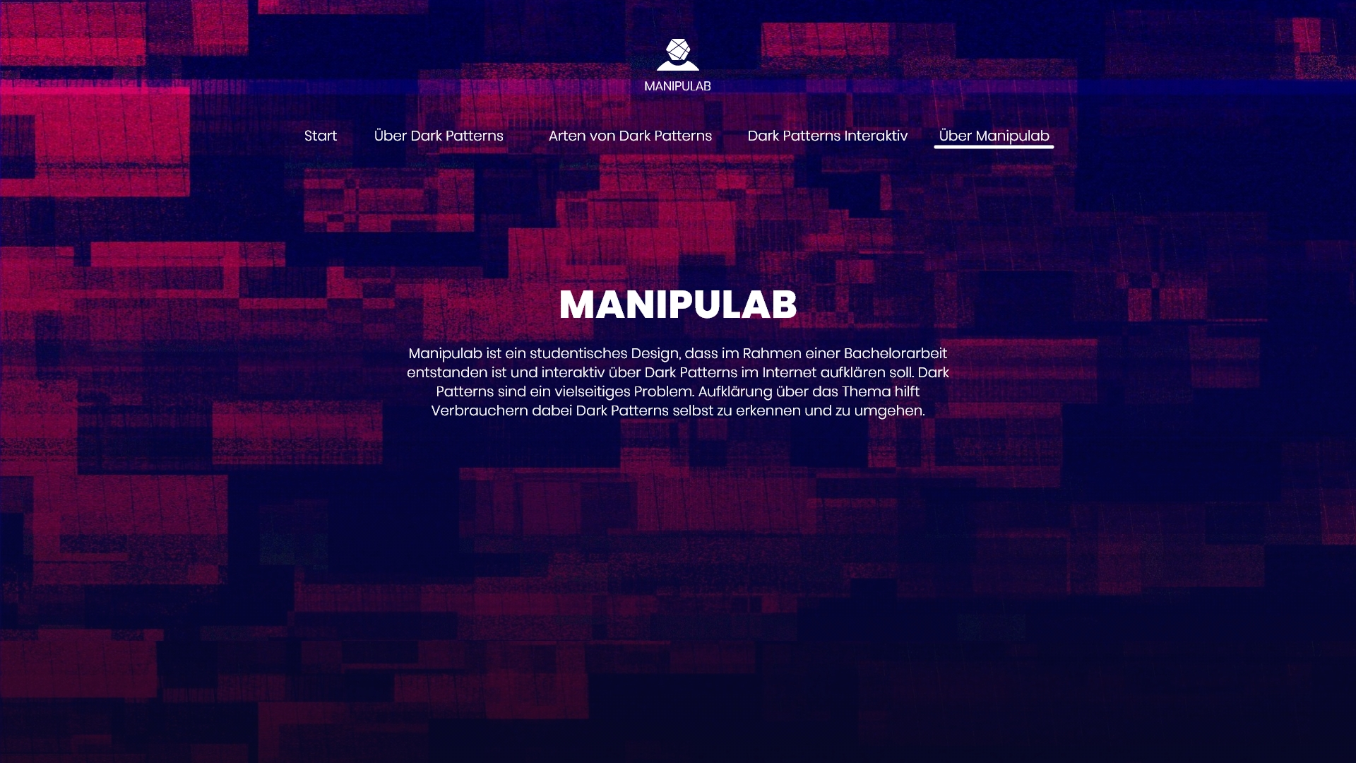
Das Design verwendet ein rot-blaues Farbschema, um Dringlichkeit und Vertrauen zu wecken, was die Täuschungstaktiken widerspiegelt. Das Logo zeigt eine hexagonale Form, die Wissenschaft und das Gehirn symbolisiert, und steht im Zusammenhang mit dem Labor-Konzept der Website sowie der Darstellung von Verhaltensmustern. Das Design lässt sich von dem Buch PsyConversion von Philipp Spreer inspirieren.


