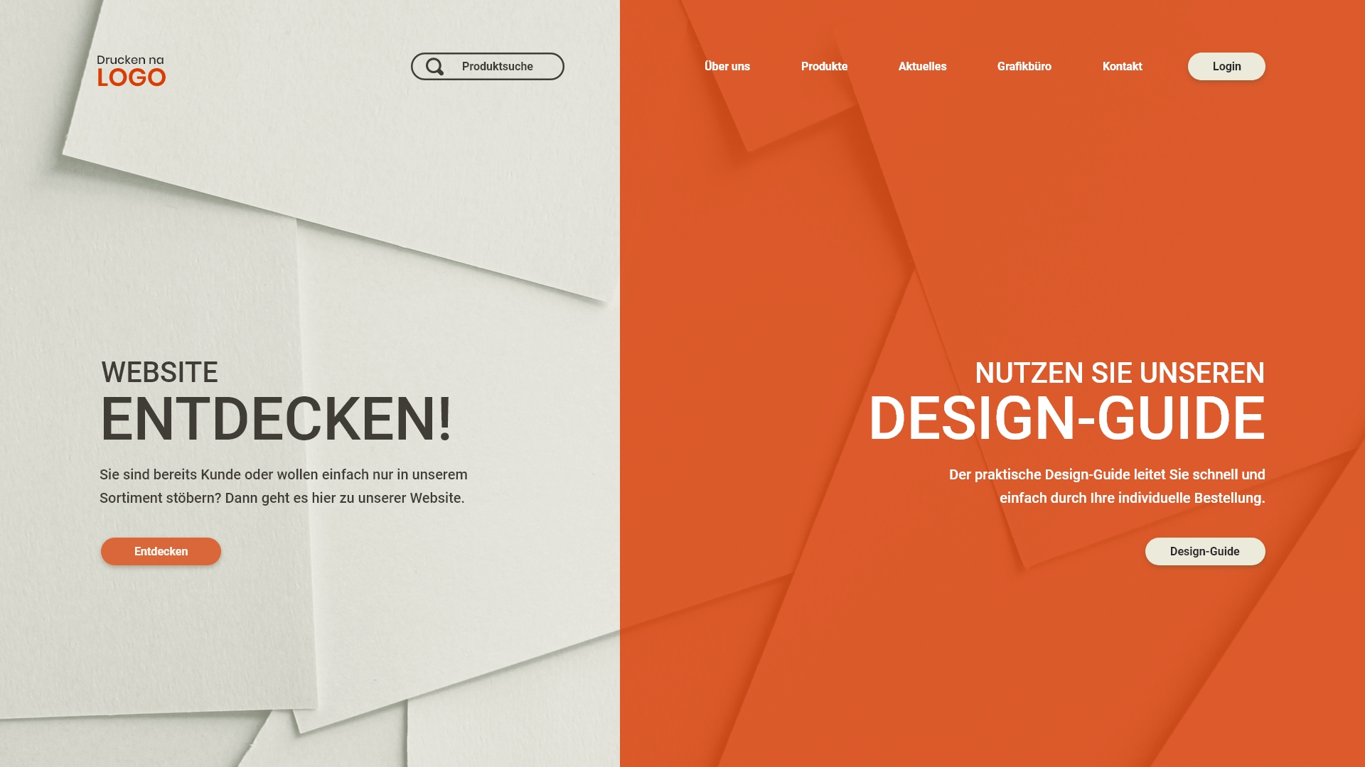
Print on demad – simple and fast. This redesign of an e-commerce platform in the print-on-demand sector enables a fast and smooth ordering and design process. The focus was on the development of a design guide that is integrated into the ordering process and intuitively helps users manage print settings.
In a student project, I undertook the redesign of a website for a print-on-demand service. The existing site was cluttered and outdated, offering too many options that made navigation difficult. User testing of the old website revealed significant issues in the ordering process, with potential customers struggling to make purchases. Additionally, the user experience was perceived as uninviting and off-putting.
Overview
Mission & Vision
Improve the attractiveness of the website in favour of both parties (users and company).
To create more satisfaction when visiting the website and at the same time help the company to become even more attractive on the market.
Experience
Goal: Creating a website that allows for different types of experiences simultaneously.
Guidance
People should be clearly guided through setting up print preferences and the subsequent purchasing process.
Interface
This should be supported by a clean UI design.
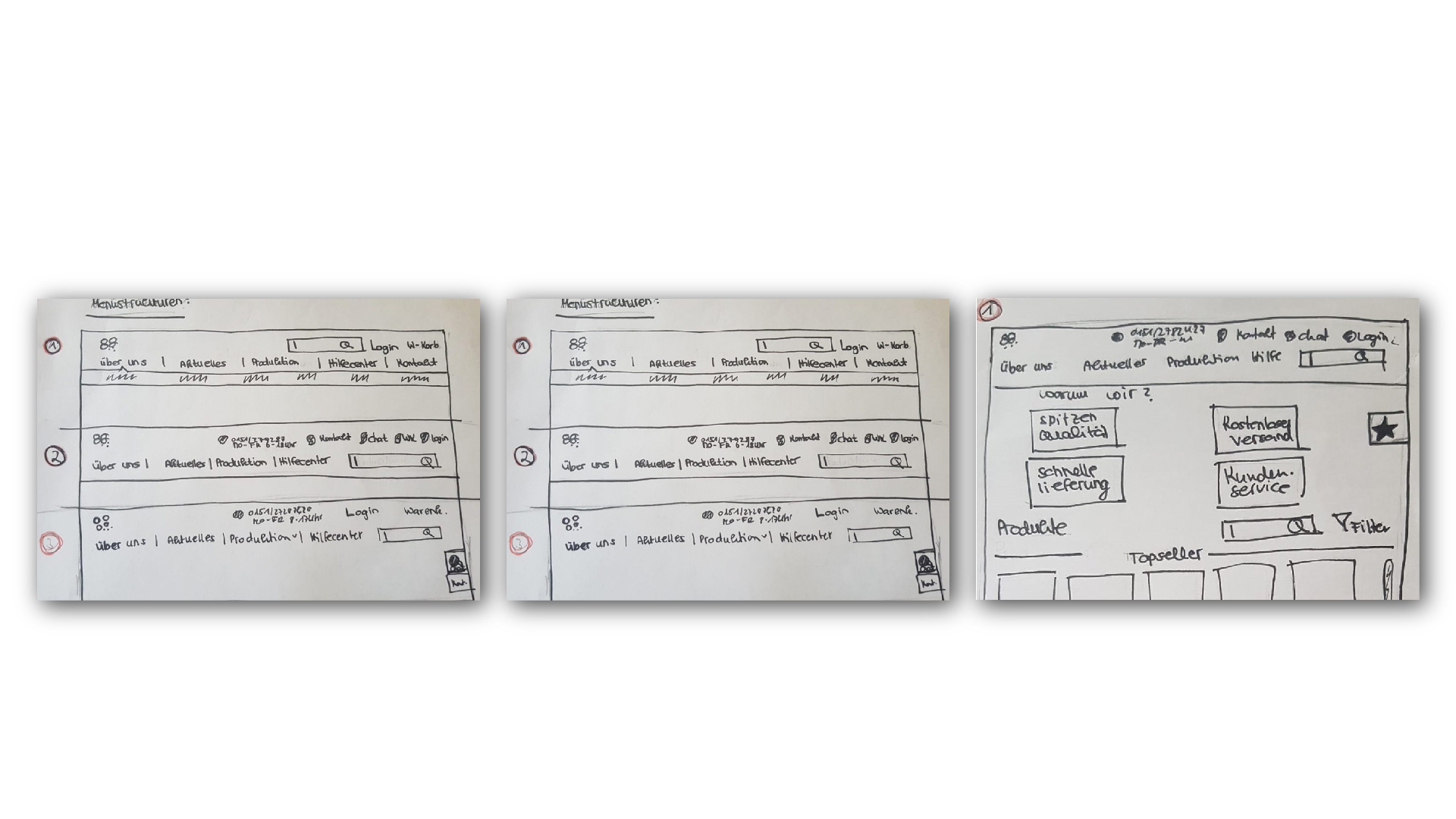
Research
Scenario & Persona
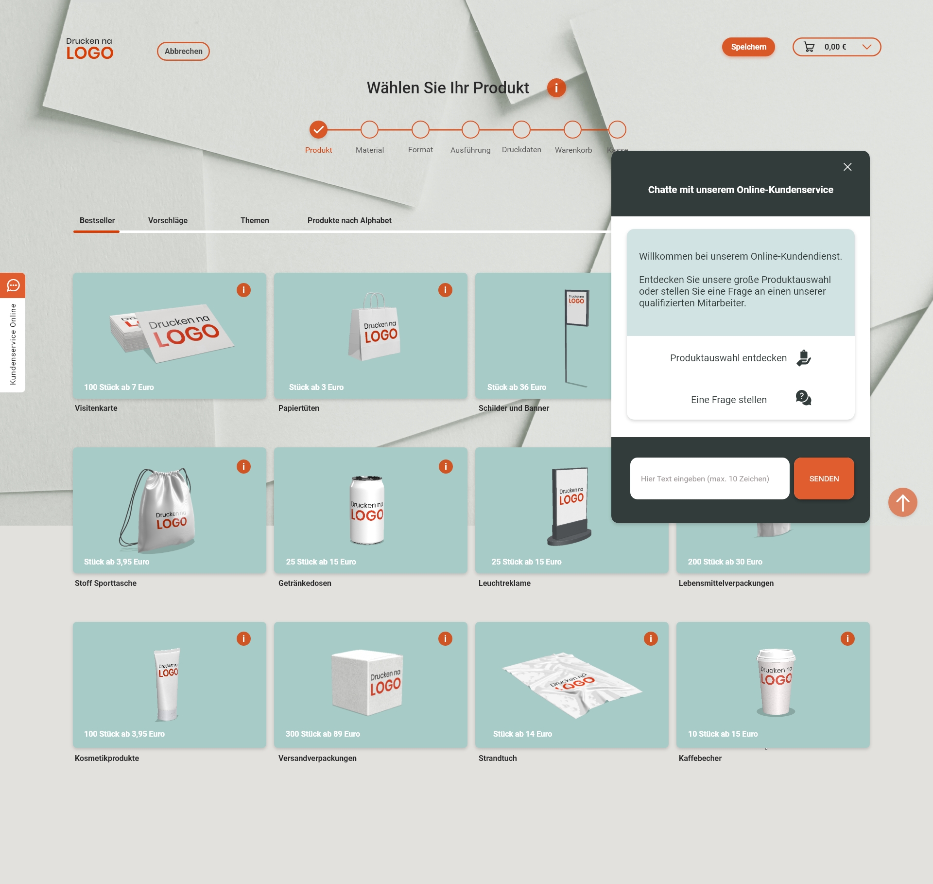
Marlene wants to grow her client base. With a new logo already designed, she now plans to print it on pillowcases, pens, and business cards. A friend recommends Drucken – Na Logo for its good prices and easy ordering.
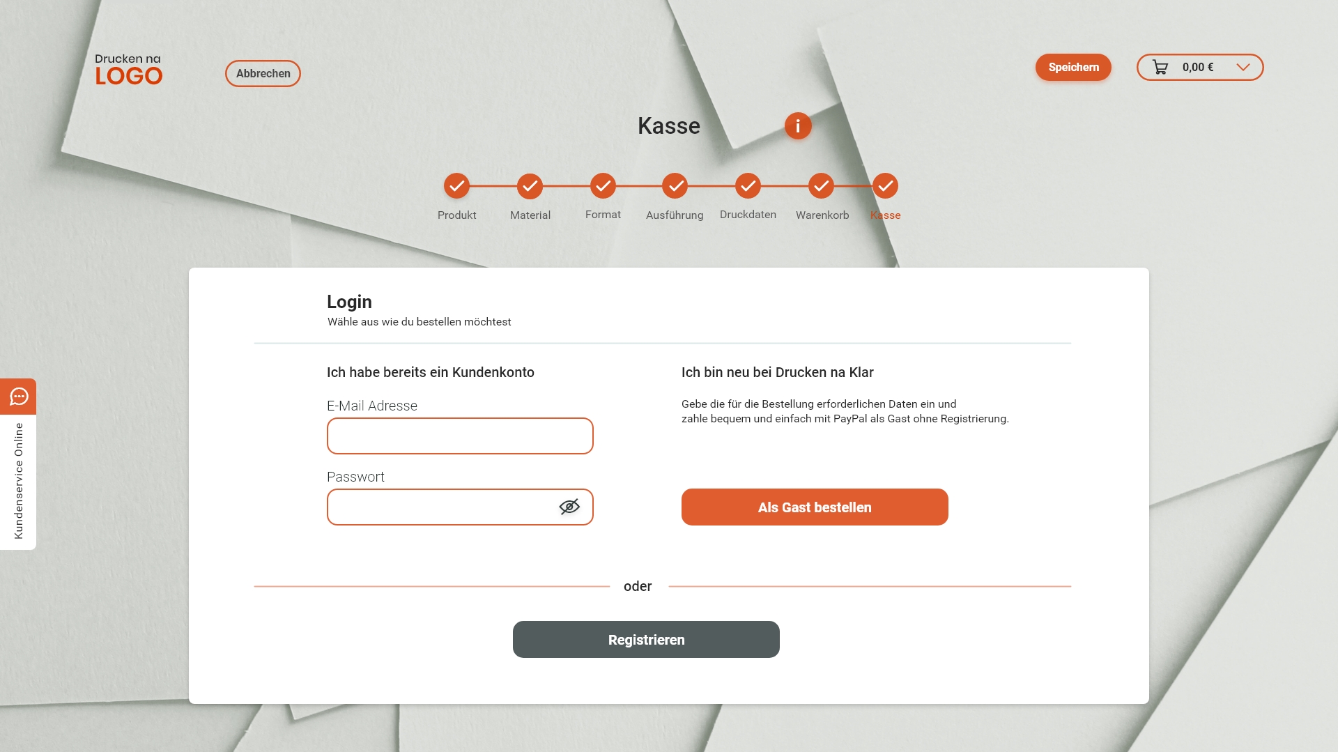
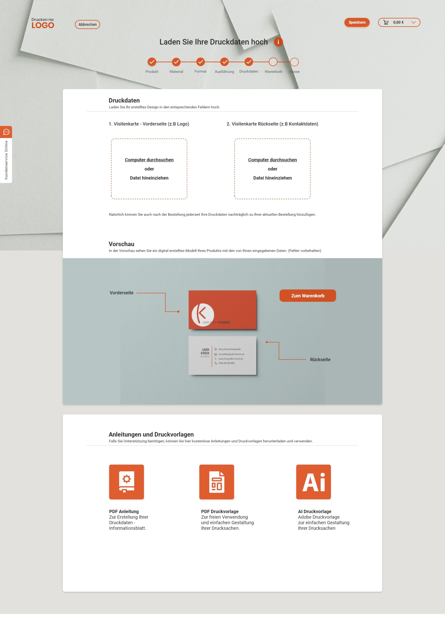
Marlene selects “Business Cards” and quickly explores the printing options. Unsure about the format and paper weight, she uses the info button for guidance. She decides on the standard format and 300g paper, then uploads her design with the help of useful tips. After confirming, she receives a success message and a product preview.
When she clicks “Add to Cart”, a pop-up asks if she wants to continue shopping or proceed to checkout. She chooses to pay, reviews her order with all selected options and costs, and completes her purchase.
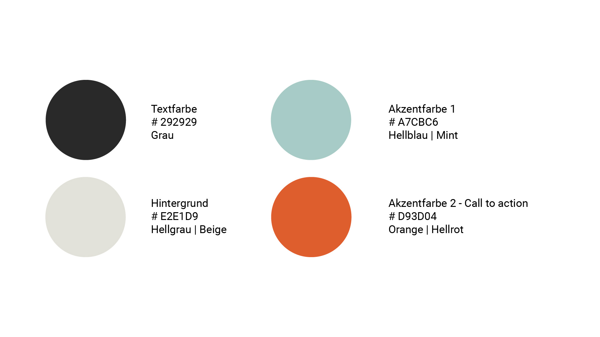
The logo and color scheme are inspired by friendly colors. The limited color palette makes the design cleaner. The logo is a paper cutout, symbolizing the analog component of the service.


